


My Experience with Crazy Eights: A Simple Tool for Better Design
How a Quick Sketching Method Helped Me Overcome Design Challenges

It's incredibly easy to become overwhelmed by indecision, whether it's choosing a place for dinner or building a business. My thoughts often loop endlessly when problem-solving, and the only way to break this cycle is through action. That's why I've adopted a technique called "crazy eights" for designing solutions to problems.
I discovered crazy eights and the concept of a design sprint through Google's UX Design course on Coursera. Without delving deeply into the intricacies of user experience or the specifics of a design sprint, I'll explain how I've utilized crazy eights to expedite my process, particularly with my Gradient Synth project.
To use crazy eights, you need a well-defined problem, a means to sketch ideas, and a few minutes. Start by dividing your sketching surface into eight equal-sized frames. Then, spend 30-60 seconds per frame sketching out a potential solution to your problem. Don't worry about the brilliance of the idea or its practicality; focus on speed. After sketching, review each box, considering whether each idea could be the best solution for your problem. I like to reflect on which designs resonate with me, which are inspiring or exciting, and which fit well with the overall project. Here are a couple of examples of how I've used crazy eights in designing different elements for Gradient Synth.
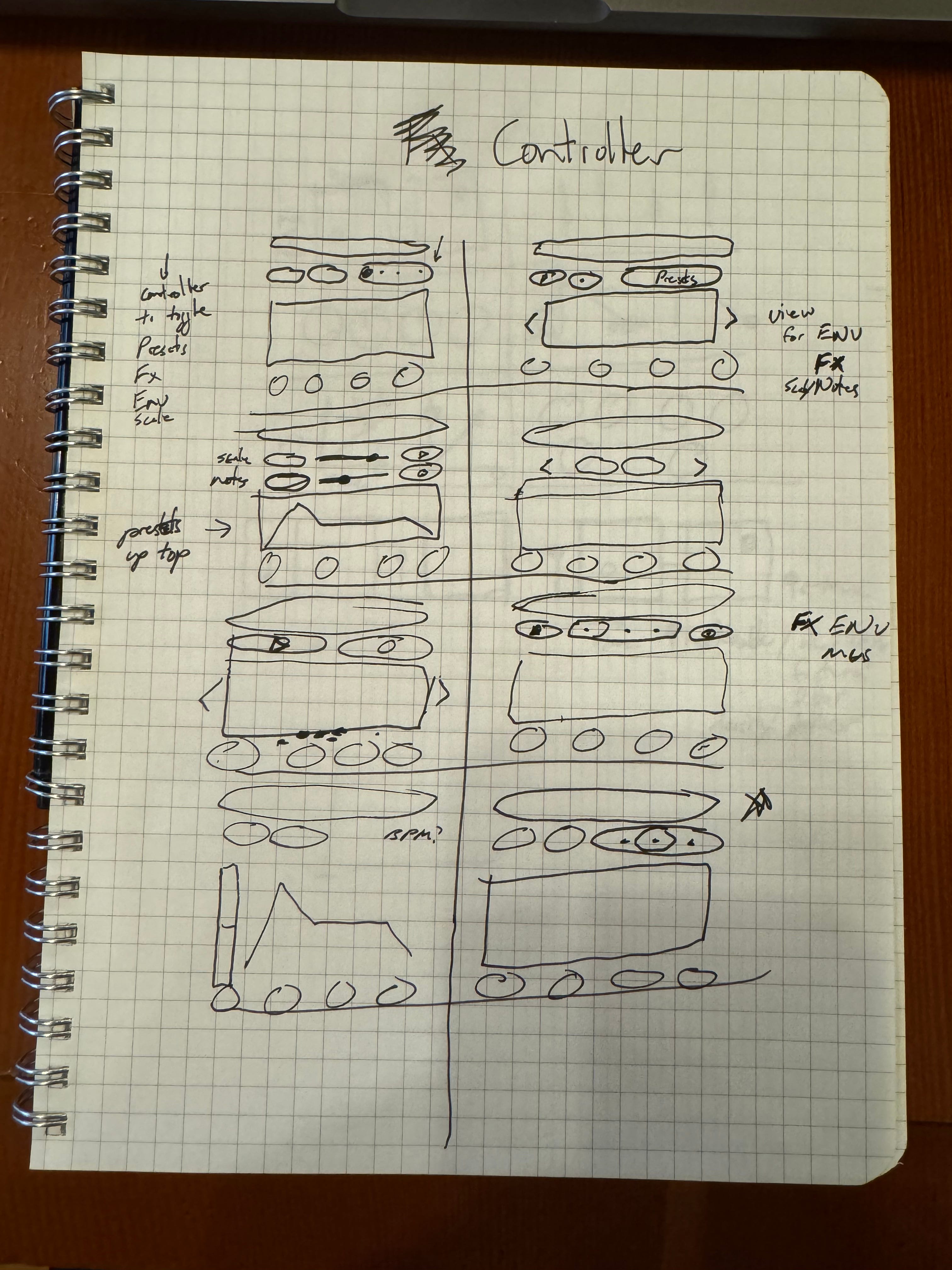
Consider the exercise I did for the controller section. My challenge was incorporating many adjustable parameters into a limited space. At the time, the text reader, record/play buttons, and colors were permanent fixtures, so I included them in most sketches.
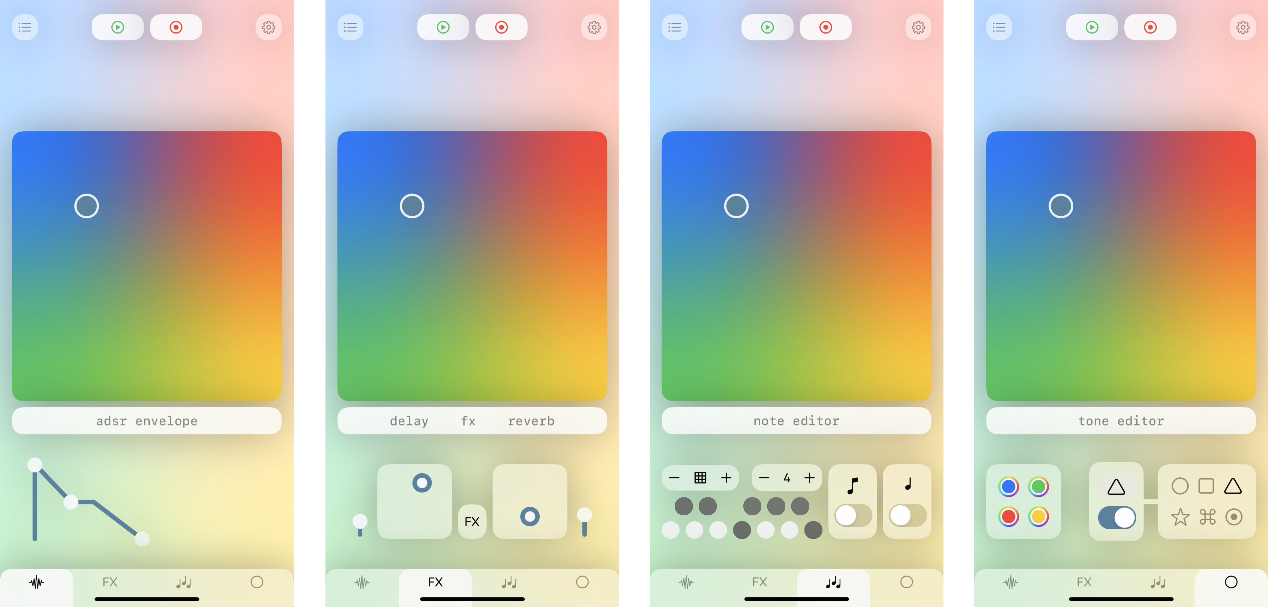
After exploring various options, I preferred the first and last sketches, which, amusingly, are almost identical! That became my direction. However, my current design has significantly evolved since then. Design is an iterative process! When I reached a prototype stage and shared it with friends and family, I realized people weren't using the gradient color circles. Integrating them into the controller section and moving the play/record buttons to the top simplified the look. Here’s the current interface, with the controller sections accessed through tabs.
Another example involves the FX editor section. The issue here was managing six parameters across two effects. Initially, I thought I only had four parameters, but as I sketched, I realized the scope was broader. The solution I liked most was in the bottom left box, with a refinement in the bottom right – these ideas shaped the current design.
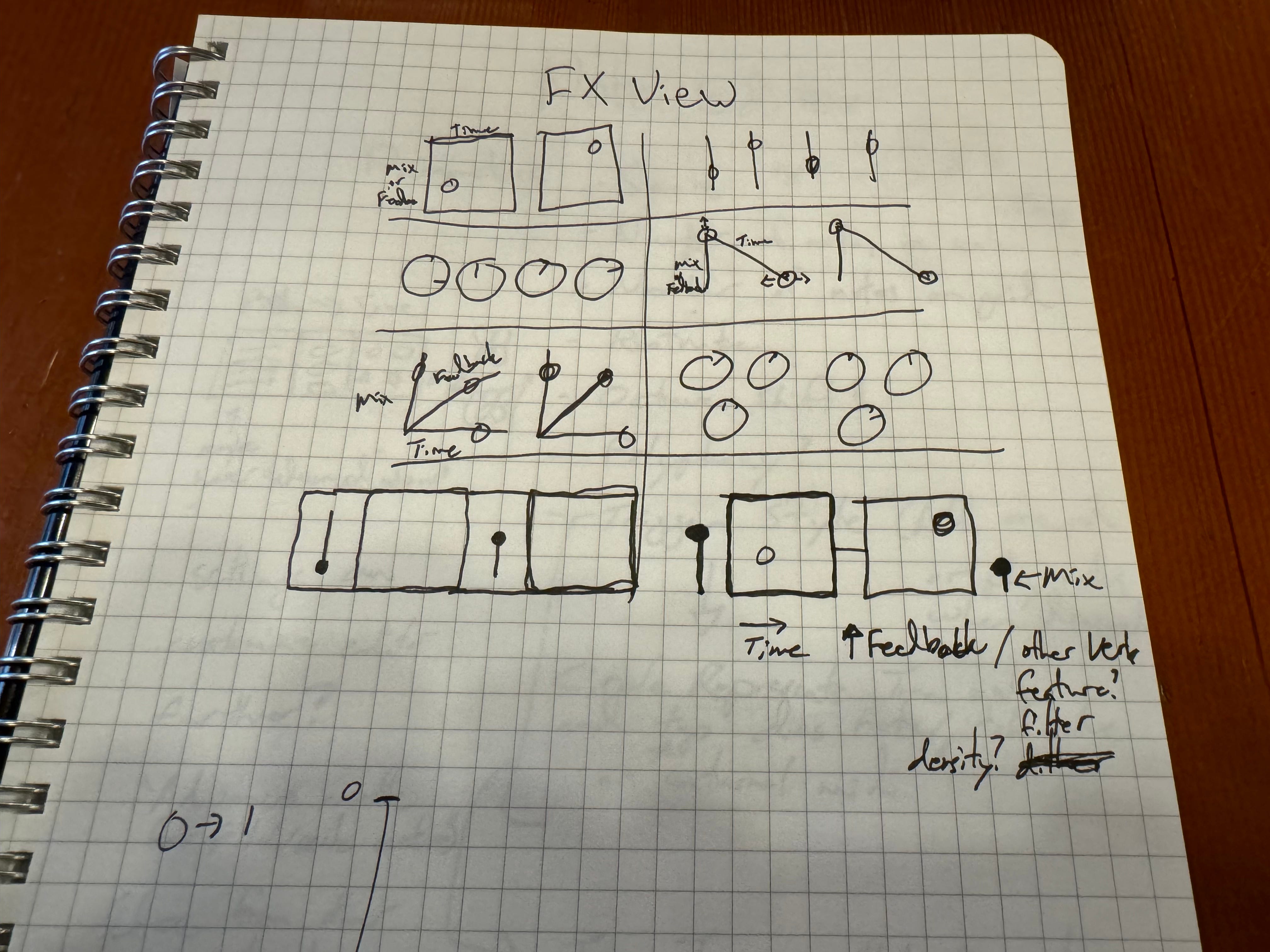
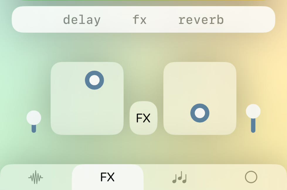
This design, like the overall user interface, will evolve based on feedback and new features. One change I've already implemented is an FX button between the two XY pads, serving as a placeholder for changing FX types. I plan to alter the mix faders' style on the left and right. Originally designed to mimic the ADSR envelope (Attack, Decay, Sustain, Release), I now believe they don't adequately convey the available mix range when not at maximum.
Using crazy eights has significantly accelerated my project. I hope you can apply this technique in your designs! Remember, the key is taking action and putting ideas down so you can respond and iterate until you find a solution that truly excites you.